Hey there, Smash Social friends!
We’re absolutely buzzing to share our newly updated website with you! We’ve given our site a sleek modern update that we think you’ll love, and we’ve added some exciting new features. One of the highlights? Our brand-new B-roll video that gives you a sneak peek into the fantastic work we do. Here’s why we’ve revamped our site and what makes the new Smash Social so special!

Why the Modern Update?
1. Streamlined Navigation:
We wanted to make your experience with our site as smooth as possible. Our previous website was great, but we felt it was time for a change to make finding information even easier. The new design means you can quickly navigate to the content you’re interested in, whether that’s learning about our services or checking out our latest case studies.
2. Showcasing Our Evolving Services:
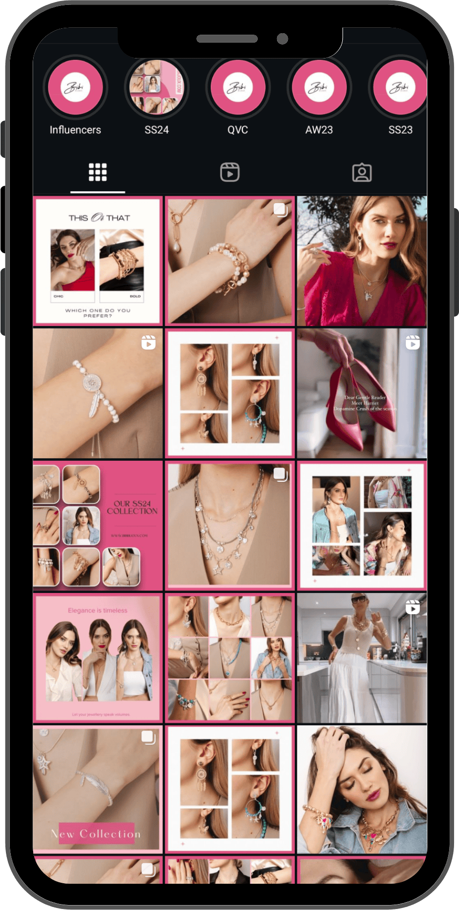
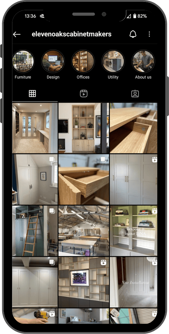
As Smash Social continues to grow and expand, we wanted our site to reflect that evolution. We’ve updated our service descriptions, added fresh case studies, and revamped our portfolio to give you a clearer picture of how we can help elevate your social media game.
3. Sleek, Modern Look:
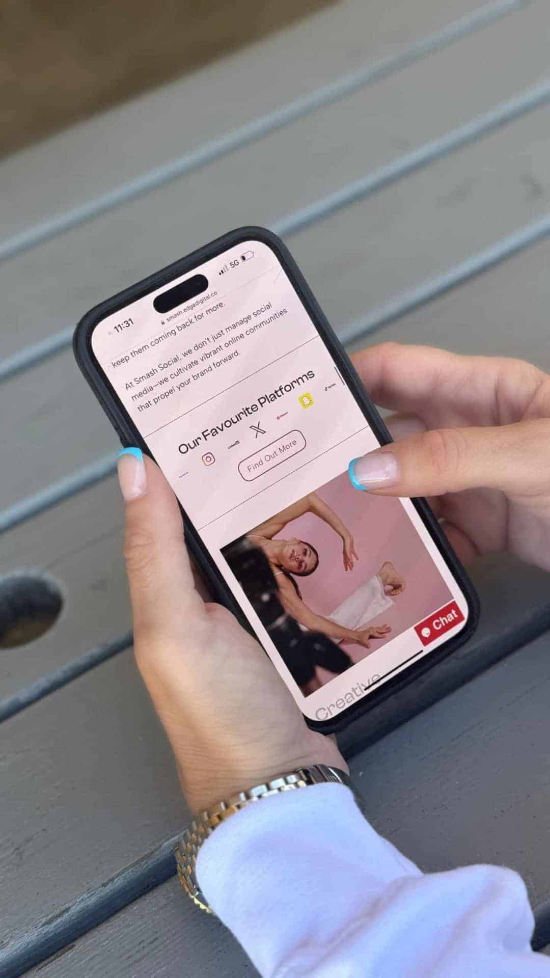
We’ve gone for a stylish, contemporary design to match our innovative approach. The new layout features vibrant visuals and a clean, modern aesthetic that’s also fully optimised for mobile devices. So whether you’re on your phone or computer, you’ll enjoy a seamless browsing experience.
4. Boosted Speed and Performance:
We’ve made sure our site loads faster and performs better. That means less waiting around and more time diving into the content and services that matter to you.
What’s New and Exciting?
1. Interactive B-roll Video:
One of the coolest features of our new site is the B-roll video that plays across different pages. This video gives you a snapshot of our work, showcasing some of the amazing projects we’ve been involved in. It’s a dynamic way for you to see our creativity in action and get a feel for the quality and style of our work.
2. Fun and Engaging Content:
We’ve packed our site with interactive elements and engaging media. From animated graphics to helpful videos, we’ve made sure visiting our site is both enjoyable and informative.
3. Simplified Navigation:
Finding your way around is now easier than ever. Our updated menu and search functions make it simple to explore our services, case studies, and more. Everything is right where you’d expect it to be!
4. Fresh Case Studies and Reviews:
Curious about how we’ve helped others? Check out our updated case studies and client testimonials. They’re filled with real-life success stories that show how we’ve made a positive impact for businesses just like yours.
5. New Resource Hub:
Our resource hub is your go-to spot for the latest blog posts, guides, and industry news. It’s packed with tips and tricks to help you stay ahead in the ever-evolving world of social media.
6. Better Ways to Connect:
We’ve made it easier for you to get in touch. Our new contact forms are straightforward, and we’ve added more ways to connect, including social media links and live chat. Whether you have a question or want to discuss your next project, we’re here to help.
Explore the New Smash Social!
We’re excited for you to explore our modern update and check out the new features, especially our B-roll video that showcases a glimpse of what we do best. We’re committed to helping you make the most of your social media, and our revamped site is just one way we’re delivering on that promise.
Thanks for being part of the Smash Social family. We can’t wait for you to experience our new site and continue this journey with us.
Check out the new look at Smash Social and let us know what you think!
Cheers,
The Smash Social Team
